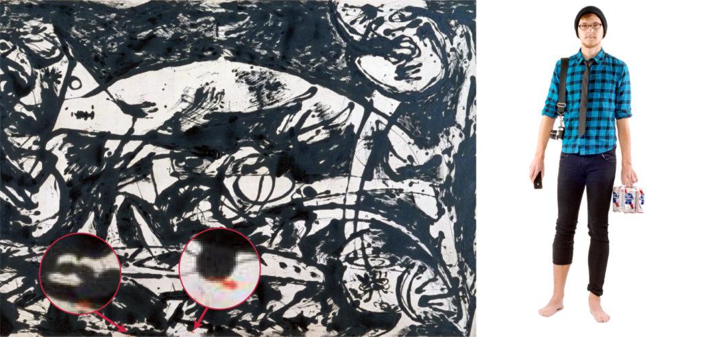
Here’s a modern art story for you.
Mid-20th century there was this real famous painter, Jackson Pollock. He had no painting skills. He was one of those painters that would make millions selling something that looked very similar to the mess a toddler makes in their highchair at breakfast.
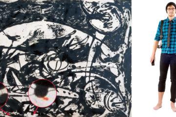
In 1951 he painted this canvas he called Number 14 (he often labelled his paintings by numbers so that people wearing frameless glasses and sipping lattes could decipher their own meaning from his mess). For a while Pollock dripped paint onto canvases using a stick… but on this occasion he got a bit lazy and just poured black paint straight from the bucket, onto the canvas he also dropped two small splashes of red paint.
So this canvas is on display and this posh art critic – the 1950’s equivalent of a hipster – goes up to it and writes that he believes the canvas to be self portrait of Jackson… that the canvas initially represented the Earth pre-humanity – vast, pure, and undamaged. He goes on to say that the splashed paint represents humanity itself – random, chaotic, overlapping and destructive. But the two red dots, those are Jackson – small, insignificant yet somehow stand out from the rest of humanity (I’ll bet you $20 this guy believed in star signs).
What actually happened…? Jackson just accidently splashed the canvas when he was doing a separate coloured painting.
My point here… is that people always perceive products, designs or objects in ways different to how they were intended to be perceived.
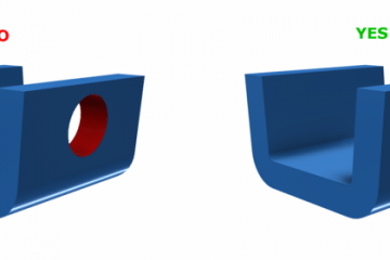
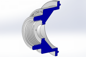
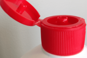
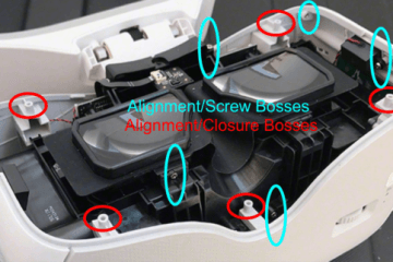
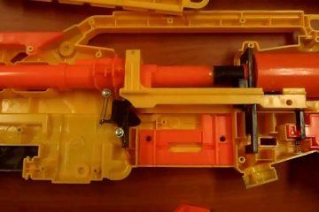
It’s impossible to force people to use your product in the specific way you want them to. This is why a good product design is one that gives people a clear understanding of the intended purpose of the product or product features.
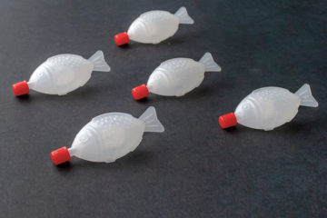
Take a train or airplane tray table for example, that circular depression tells you where you are meant to put your cup. There’s no particular signs or messages saying you have to put it there, but you do it because there’s a little subconscious signal in your head telling you that you’re meant to.
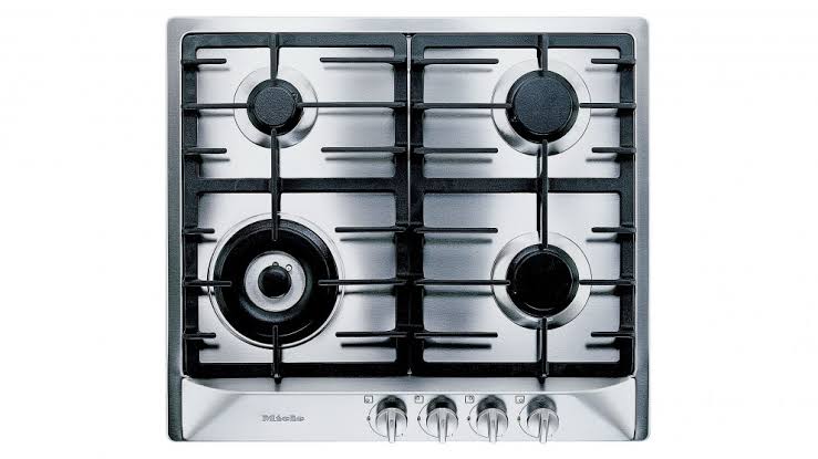
A bad example of this would be stovetops that have the dials arrange linearly – if they were in a square you would know which dial is for which burner but because it isn’t there, they have to put a little diagram next to each dial.
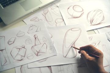
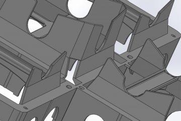
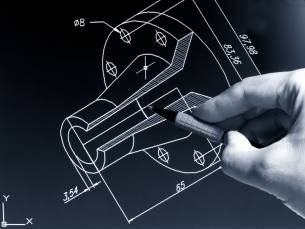
To do good product design, you have to consider these little signals that an object can give off, and then you have to design for them.
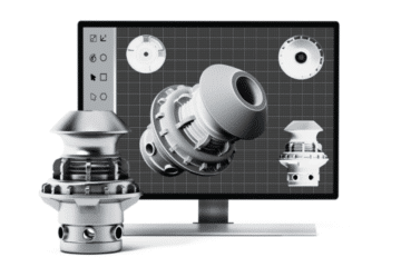
At Dienamics our team has the experience and know how to make your product idea into a good design – one that makes sense and can be understood by the people purchasing it.
Book a session with us to come in and discuss the best way for you to design your idea.
Subscribe to Our Newsletter
Get the latest news from Dienamics into your inbox